If you have ever sat through an Operating Systems lecture, you know the drill. The professor draws a long, horizontal rectangle on the whiteboard, chops it into uneven blocks, and starts scribbling acronyms like FCFS, SJF, and RR. You spend the next hour calculating “Turnaround Time” and “Waiting Time” by hand, trying to remember if Process 3 arrived at millisecond 4 or 5.
It is tedious, it is dry, and honestly? It completely misses the magic of what is actually happening inside your machine.
CPU scheduling isn’t just a math problem to solve for your midterms. It is the invisible traffic cop that keeps your entire digital life from crashing. Every time you stream a video, compile code, and run a Discord call at the exact same time, your CPU scheduler is making thousands of split-second decisions to ensure nothing freezes.
When you stop calculating these algorithms on paper and start using a CPU Scheduling Algorithm Visualizer, everything clicks. You stop seeing numbers and start seeing flow, bottlenecks, and the delicate balance of system architecture.
Let’s tear down the textbook definitions and look at how these algorithms actually work in the real world—and why visualizing them is the ultimate cheat code for understanding backend engineering.
The Core Problem: Who Gets the Mic?
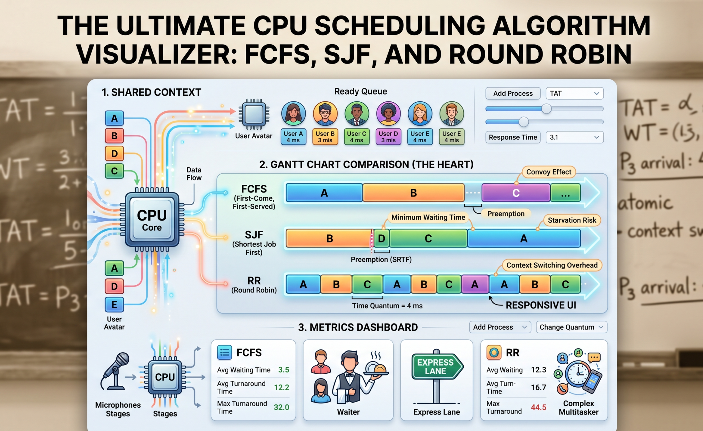
Imagine a single CPU core as a single microphone on a stage. You have a hundred people (processes) in the crowd who desperately need to speak. Some need the mic for ten seconds to shout a quick message; others want to read an entire novel.
If the CPU just lets anyone grab the mic whenever they want, chaos erupts. The OS needs a strict set of rules—an algorithm—to manage the “Ready Queue.” Let’s look at the three heavy hitters you will find in any scheduling visualizer.
1. First-Come, First-Served (FCFS): The Grocery Store Line
FCFS is the most primitive scheduling algorithm in existence. It is strictly fair in a chronological sense, but completely blind to efficiency.

-
The Rule: Whoever arrives in the Ready Queue first gets the CPU until they are completely finished. No interruptions. (This is called non-preemptive scheduling).
-
The Visualization: If you plug FCFS into a visualizer, the resulting Gantt chart looks like a simple train. Process 1 finishes, Process 2 starts.
-
The Fatal Flaw: Have you ever been in a rush at the grocery store with just a bottle of water, but the person in front of you has two overflowing carts and is paying with spare change? That is the Convoy Effect. If a massive process (like a heavy database backup) hits the CPU first, every tiny, lightning-fast process behind it has to sit idle. In a visualizer, you will see a massive block of color taking up the timeline, while the “Waiting Time” metric for all other processes skyrockets. In the real world, this means your computer’s UI freezes entirely while a background task hogs the system.
2. Shortest Job First (SJF): The Express Checkout
To fix the Convoy Effect, engineers designed Shortest Job First. Instead of looking at who arrived first, the OS scans the queue and asks: “Who can finish their job the fastest?”

-
The Rule: The process with the smallest “Burst Time” (execution time) gets the CPU next.
-
The Visualization: In a visualizer, SJF is incredibly satisfying to watch. You will see the CPU rapidly knocking out tiny blocks of execution one after another, clearing out the queue with ruthless efficiency before finally tackling the bigger blocks. Mathematically, SJF guarantees the lowest possible average waiting time for any set of processes.
-
Preemptive vs. Non-Preemptive: SJF has a highly aggressive variant called Shortest Remaining Time First (SRTF). Imagine a medium-sized process is currently running, and suddenly a tiny process arrives. In SRTF, the OS actually pauses (preempts) the running process, kicks it back to the queue, and lets the tiny process run. Visualizers show this beautifully as fragmented blocks of color—a process starting, getting interrupted, and finishing later.
-
The Fatal Flaw: SJF introduces a dark concept called Starvation. If your system is constantly bombarded by tiny, fast processes, a large, heavy process will keep getting pushed to the back of the line forever. It starves to death waiting for CPU time.
Our Portfolio Makeuser
3. Round Robin (RR): The Ultimate Multitasker
Round Robin is the algorithm that makes modern computing possible. It is the reason you can listen to Spotify, type in a browser, and download a file seamlessly. It doesn’t care about how long your job is; it only cares about fairness.
-
The Rule: Every process gets a strict, non-negotiable time limit called a Time Quantum (or time slice). Let’s say the quantum is 4 milliseconds. The CPU runs Process A for 4ms. If it’s not done, the OS aggressively pauses it, moves it to the back of the line, and gives the next 4ms to Process B.
-
The Visualization: A Round Robin visualizer looks like a colorful mosaic. The Gantt chart is heavily fragmented into equal-sized blocks as the CPU rapidly cycles through the queue.
-
The Goldilocks Problem: The secret sauce of Round Robin is tuning that Time Quantum. This is where a visualizer is invaluable.
-
If you set the Time Quantum too high (e.g., 1000ms), the algorithm just turns into FCFS. Processes finish before their time is up.
-
If you set the Time Quantum too low (e.g., 1ms), the system spends more time switching between tasks than actually doing work. This is called Context Switching Overhead. In a visualizer, you can actually see the system efficiency plummet as the CPU wastes clock cycles just saving and loading Process Control Blocks (PCBs).
-
Beyond the Chart: Reading the Metrics
A good visualizer doesn’t just draw a pretty Gantt chart; it calculates the cold, hard metrics that define system performance. When you are analyzing a simulation, here is what those numbers actually mean:
-
Arrival Time & Burst Time: The inputs. When did the process show up, and how much raw CPU time does it need?
-
Turnaround Time (TAT): The total lifecycle of the process. From the exact millisecond it entered the system to the millisecond it finally exited. (TAT = Completion Time – Arrival Time).
-
Waiting Time (WT): The metric of frustration. This is the total time a process spent sitting in the Ready Queue doing absolutely nothing. (WT = Turnaround Time – Burst Time).
-
Response Time: This is crucial for user experience. It is the time between a process arriving and the very first time it gets to run. If you click a button on a website, Response Time dictates how long it takes for the loading spinner to at least show up. Round Robin has fantastic response time; FCFS has terrible response time.
Why Developers Build Visualizers
If you are a full-stack developer or software engineer, building an algorithm visualizer from scratch is a masterclass in frontend state management and logic.
Under the hood, a scheduling visualizer is just a complex state machine. You have to build a “clock” loop that ticks forward, checking the arrival times of your data objects. For an algorithm like Round Robin, you have to manage a simulated queue array, pushing and popping objects as the Time Quantum expires.
Rendering the Gantt chart pushes your CSS Grid or Canvas skills to the limit, as you have to dynamically calculate the width of div elements based on burst times and ensure they map perfectly to a visual timeline. It is the perfect portfolio project because it proves you understand both low-level system logic and high-level UI rendering.
The Big Picture
Operating System concepts can feel incredibly abstract, but they are the foundation of everything we build in tech. Whether you are configuring a load balancer for an AWS cluster, writing background workers in Node.js, or optimizing database queries, you are essentially dealing with scheduling algorithms.
By using—or better yet, building—a CPU Scheduling Algorithm Visualizer, you pull back the curtain on the OS. You stop memorizing formulas for exams and start intuitively understanding how computers balance fairness, speed, and efficiency under immense pressure.