We’ve all been there: you’re staring at a webpage, you click a button, and… nothing happens. Or so it seems. Ten seconds later, you realize a tiny red error message appeared at the top of the page, but you completely missed it because you were looking at the bottom.
This is where webpage animations to alert users come into play. Animation isn’t just “eye candy” or a way to make a site look fancy; it’s a vital communication tool. World where our attention spans are shorter than ever, motion is the only language that can instantly cut through the noise and tell a user, “Hey, look here!”
In this guide, we’re going to dive deep into how you can use motion to create smarter, more intuitive alerts. We’ll cover everything from the psychological triggers that grab a user’s eye to the technical frameworks that keep your site running smoothly. Whether you’re building a simple contact form or a complex AI dashboard, mastering these 10 animation strategies will transform your UI from a static screen into a living, breathing conversation.
1. The Psychology of Motion Alerts
How to Grab Attention Without Overwhelming the User
Our brains are actually hardwired from ancient times to notice movement. Back then, movement meant a predator or a source of food. On a screen, movement means “pay attention to this.” In the world of design, we call this preattentive processing it’s the information your brain grabs before you even realize you’re looking at it.
Why Hierarchy Matters
When everything on a page is moving, nothing is important. To create a strong visual hierarchy, you have to use motion sparingly. If a “Submit” button gently pulses, it draws the eye as the primary focal point. But if five different banners are sliding in at once, the user experiences cognitive overload. They get frustrated, their “user friction” goes through the roof, and they’ll likely just close the tab.
Beating “Change Blindness”
Have you ever been looking at a website and a sidebar suddenly appeared, but you didn’t notice it for several seconds? That’s change blindness. If a change happens too instantly, the human eye often misses it. By using a smooth transition like a notification sliding in from the right you “lead” the user’s eye to the new information. You’re essentially holding their hand and saying, “Look over here for a second.”
Finding the Balance
The goal of a great alert is to be helpful, not annoying.
-
High-urgency alerts (like a payment failure) can be a bit “louder” with a quick shake or a bright flash.
- Low-urgency alerts (like “Settings Saved”) should be whisper-quiet, perhaps just a soft fade-in that disappears on its own.
2. Status Indicators and System Feedback
Communicating Real-Time Progress and Success
Have you ever clicked a “Submit” button and then sat there wondering if the website actually heard you? That moment of silence is a killer for user experience. If a page doesn’t react within a fraction of a second, our brains start to think it’s broken. This is where animation acts as the “heartbeat” of your website.
Giving the “All Clear”
When a user finishes a task like uploading a file or sending a message they need a “Success” signal. A static “Done” message is okay, but a success checkmark that draws itself in with a quick, springy animation feels rewarding. It’s a tiny hit of dopamine that tells the user, “You did it, and everything is fine.”
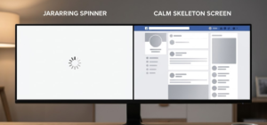
The Art of the Wait
Nobody likes waiting, but we hate uncertainty even more. This is why we use progress bars and skeleton screens.
-
Skeleton screens are those gray, pulsing boxes you see on Facebook or LinkedIn before the actual photos and text load.
-
By animating these “ghost” versions of the content, you’re alerting the user that the layout is ready and the data is on its way. It makes the wait feel shorter than it actually is.
Moving vs. Static
Imagine a loading spinner that’s just a frozen circle. You’d probably refresh the page immediately, right? An animated spinner alerts the user that the “system” is still alive and working in the background. We call these indeterminate loaders because they don’t tell you exactly when the task will finish, but they promise that the site hasn’t crashed.
State Transitions
A good status alert isn’t just about the “Loading” part; it’s about the transition. When a button morphs from a “Submit” label into a spinning circle, and finally into a green checkmark, you are telling a story. You’re guiding the user through the beginning, middle, and end of an action without them having to read a single line of status text.
Quick Comparison: Which Animation to Use?
| Scenario | Best Animation | Why? |
| Short Wait (< 2s) | Loading Spinner | Simple “heartbeat” to show life. |
| Long Wait (> 3s) | Progress Bar | Reduces anxiety by showing a finish line. |
| Data Loading | Skeleton Screen | Prepares the user for the layout. |
| Task Complete | Animated Checkmark | Provides a “reward” and finality. |
3. High-Urgency Notification Styles

Using Motion to Signal Critical Errors
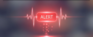
We’ve all been there: you click “Submit” on a long form, nothing happens, and you’re left scrolling up and down trying to find the red text you missed. That is a failure of design. High-urgency animations are designed to stop the user in their tracks and say, “Wait, we need to fix this before we move on.”
The “Shake” Effect: The Universal “No”
Think about how you shake your head to say “no.” We’ve brought that human gesture into web design. When a user enters the wrong password and the input box gives a quick horizontal shake, they instantly understand the error. It’s an intuitive urgency cue that doesn’t need a “Warning” label to be understood.
The Power of the Pulse
Sometimes an error isn’t a one-time event; it’s a state that needs fixing. A pulse effect where a button or a border slowly grows and shrinks in a bright color acts like a beacon. It’s hard for the human eye to ignore a pulsating element. It creates a “look at me” moment that helps the user find exactly where the problem is on a crowded page.
Color-Shift Transitions
Color and motion are best friends when it comes to alerts. A smooth color-shift transition (like a white background fading rapidly into a soft red) signals a change in the “mood” of the interface. It tells the user that the environment has changed from “entry mode” to “correction mode.”
Animation “Choreography”
When a critical error happens, the way the alert enters the screen matters. A sudden “pop” can be startling, but a fast “wobble” keyframe or a quick slide-down from the top of the screen feels deliberate. This is called “choreography” arranging the motion so it feels like a natural reaction to the user’s mistake.
When to Use “Loud” Animations
4. Subtle “Toast” and Snack-bar Transitions
Non-Intrusive Temporary Messaging
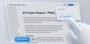
Think of a “Toast” notification like a literal piece of toast popping up from a toaster. It appears, tells you what you need to know, and then goes away on its own. These are perfect for low-stakes information, like “Message Sent,” “Item Added to Cart,” or “Link Copied to Clipboard.” Since they don’t block the user from working, the animation needs to be smooth and “quiet.”
The “Slide-In” Entrance
Most toasts don’t just appear out of thin air; they slide in from the corner of the screen (usually the top right or bottom left). This movement is key because it catches the eye just enough to be noticed, but because it stays in the “peripheral vision” area, it doesn’t interrupt the user’s main task.
Easing Functions: Making it Feel Natural
In the real world, objects don’t move at a constant, robotic speed they speed up and slow down. In CSS, we use easing functions (like ease-in-out) to make these alerts feel human. A toast that “bounces” slightly or slows down as it reaches its final position feels much more polished than one that moves at a rigid, linear speed.
The “Auto-Dismissal” Fade
One of the best things about a toast is that the user doesn’t have to click “X” to close it. The animation handles the exit. A common technique is a fade-out combined with a slight move upward. This tells the user, “I’m done here,” and helps the notification “evaporate” from their consciousness so they can keep working.
Layering with Z-Index
Technically, these alerts live on a different “layer” of your website. We use a property called z-index to make sure the alert floats above everything else. The animation should reflect this; sometimes a subtle drop shadow that appears as the toast slides in helps it look like it’s physically sitting on top of the page, making it easier for the brain to separate the “alert” from the “content.”
The “Polite Alert” Checklist
-
Placement: Keep them in the corners. Don’t cover the main buttons the user is trying to click.
-
Duration: 3 to 5 seconds is the sweet spot. Long enough to read, short enough to stay out of the way.
-
Motion: Use a “Slide and Fade” combo for the smoothest experience.
-
Color: Use subtle colors (blue for info, green for success) so they don’t look like scary error messages.
5. Micro-interactions for Form Validation

Real-Time Input Guidance and Correction
In the old days of the web, you’d fill out a whole form, click “Submit,” and only then find out you made a mistake. Modern web design uses “inline validation” animations that give you feedback the second you finish typing.
The “Wiggle” and “Bounce”
If you type an email address and forget the “@” symbol, the input box might give a tiny wiggle effect. This is a “micro-alert.” It’s not a full-screen error; it’s just a gentle nudge saying, “Check this real quick.” On the flip side, when you meet all the requirements for a strong password, a bounce animation on a green checkmark tells you you’re good to go.
Focus Rings and Active States
Have you noticed how a text box often glows or changes color when you click into it? This is a focus ring animation. By animating the border-color or adding a subtle outer glow, you are alerting the user: “This is where you are currently typing.” It prevents the user from getting lost on a page with many fields.
Morphing Icons
One of the coolest trends in alert animation is the morphing icon. Imagine a “Submit” button that, once clicked, smoothly shrinks into a circle and then expands into a “Success” icon. This tells a story of progress. Instead of jumping between different images, the element “morphs” from one state to another, which is much easier for the human brain to follow.
Path Animations
For high-end websites, we often see SVG path animations. This is when a line literally “draws” itself around an input box to show it’s active, or a “X” draws itself to show an error. It feels premium and high-tech, alerting the user to their status with a touch of elegance.
Why Micro-interactions Matter
| Feature | Animation Type | User Benefit |
| Password Strength | Color-shifting bar | Instant visual “score” of their security. |
| Required Fields | Subtle shake | Catches the error before the user clicks “Submit.” |
| Typing Feedback | Pulsing cursor | Confirms the website is receiving their input. |
| Form Sent | Button morphing | Clear visual confirmation of a finished task. |
6. Full-Screen Modals and Overlays
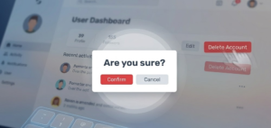
Interruptive Alerts for Critical Decisions
A modal (or “pop-up”) is the heavy hitter of web alerts. It demands the user’s full attention by dimming the rest of the page. If a modal just “appears” instantly, it can feel like a glitch or a jump-cut in a movie. Animation is what makes the appearance feel like a deliberate “layer” being added to the screen.
The “Scale-Up” Entrance
Instead of just appearing, most modern modals start slightly smaller and scale up to their full size. This “zoom” effect tells the brain that the alert is moving closer to the user, physically separating it from the background content. It’s a clear signal that says, “Stop what you were doing; look at this now.”
Backdrop Blur and Dims
To make the alert stand out, we use an overlay (the dark background). A great way to animate this is with a backdrop blur that slowly frosts the glass of the website behind the modal. This creates a “depth of field” effect, much like a camera focusing on a person while blurring the trees behind them. It alerts the user that the background is temporarily “locked” and inactive.
Scroll-Locking and “Entrance Choreography”
When a modal alerts a user, the page behind it should stop moving. This is called scroll-lock. To make this feel natural, the modal shouldn’t just slam into place. It should “float” in perhaps with a slight slide from the top and the background should dim at the exact same speed. This “choreography” makes the alert feel like a premium part of the app rather than an annoying ad.
Exit Transitions
How an alert leaves is just as important as how it arrives. If a user clicks “Cancel,” the modal should scale down or fade out quickly. A snappy exit animation alerts the user that they are now “back” in the main environment and can continue their work.
The Anatomy of a High-Impact Modal Alert
| Element | Animation Role | Psychology |
| The Background | Slow Darken/Blur | “The rest of the world is on pause.” |
| The Box | Scale-Up or Slide-Down | “I am the most important thing right now.” |
| The ‘X’ Button | Hover Pulse | “You can leave whenever you want.” |
| The Action Button | Bright Glow/Shake | “You need to make a choice here.” |
7. Dynamic Badge and Icon Notifications
Alerting Users to New Activity
A badge is a tiny visual alert attached to an icon (like a bell, a shopping cart, or a profile picture). Its job is to tell the user: “Something has changed since you last looked.” Because they are so small, animation is what makes them impossible to miss.
The “New” Dot Pulse
When a new message arrives, a static red dot might go unnoticed. But a pulse animation where the dot subtly grows and shrinks or has a faint “ripple” effect behind it is like a heartbeat. It signals that the information is “live” and waiting for you. This is a classic preattentive cue; your eyes will catch the movement even if you are reading an article on the other side of the screen.
Numeric Increments: The “Pop” and “Slide”
When a notification count goes from “1” to “2,” the number shouldn’t just switch instantly. A small scale-up “pop” or a vertical slide (where the old number slides out and the new one slides in) alerts the user to the growth of the activity. It makes the interface feel reactive and energetic.
Spring Physics for Tactile Feedback
The best badge animations don’t move like robots; they move like they’re attached to a spring. In web development, we call this spring physics. When a badge appears, it might “overshoot” its size for a split second and then settle back down. This makes the alert feel like a physical object, which is much more satisfying to the human brain than a flat, digital appearance.
SVG Path Animation for Icons
Sometimes, the icon itself becomes the alert. Instead of a badge, a “Bell” icon might jiggle or swing back and forth when a notification arrives. By animating the SVG path (the actual lines of the drawing), you create a high-quality alert that feels like a custom part of the brand’s personality.
The Anatomy of a “Micro-Alert”
| Feature | Animation Type | Message to User |
| New Message | Pulsing “New” Dot | “Something is waiting for you.” |
| Cart Update | Number Slide-Up | “You just added an item.” |
| Urgent Alert | Jiggling Icon | “Look at this immediately!” |
| Activity Feed | Scaling Pop-in | “New content has just arrived.” |
8. Accessible Animation (A11y)
Designing for Users with Motion Sensitivity
Some users have vestibular disorders (inner ear issues) that cause vertigo, nausea, or headaches when they see sliding or zooming movements. Others may have photosensitive epilepsy, where certain flashing frequencies can trigger seizures. Our job is to alert them without hurting them.
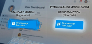
Respecting “Reduced Motion” Preferences
Most modern operating systems (Windows, macOS, iOS, Android) have a setting called “Reduce Motion.” As a developer, you can detect this using a CSS media query called prefers-reduced-motion. When this is turned on, your “alert” shouldn’t slide or bounce; it should simply fade in or just appear statically. It’s the digital version of whispering instead of shouting.
The “Stop” Rule (WCAG 2.1 Compliance)
The Web Content Accessibility Guidelines (WCAG) are the gold standard for the web. One of their biggest rules is that if an animation lasts longer than five seconds, the user must be able to pause, stop, or hide it. If you have a pulsing alert that stays on the screen forever, you need to provide a way for the user to turn that pulse off.
Avoiding the “Flicker” Trap
To keep alerts safe, you must avoid any animation that flashes or flickers more than three times in a single second. This “three-flash rule” is critical for preventing seizures. When you design an alert to grab attention, focus on smooth color transitions or slow scaling rather than rapid blinking.
Thresholds of Motion
Not all motion is created equal. Moving a small badge (Heading 7) is usually safe, but moving a massive full-screen background (Heading 6) is high-risk. We use “thresholds” to decide when an animation is too much. If an alert covers more than a small percentage of the screen, the motion needs to be incredibly subtle.
The Accessibility Checklist for Alerts
| Risk Factor | Safe Alternative | Why? |
| Fast Sliding | Instant Appear or Fade | Prevents motion sickness and vertigo. |
| Rapid Blinking | Soft Pulsing (Slow) | Eliminates seizure risks (Epilepsy). |
| Infinite Looping | Play once, then stay static | Reduces cognitive distraction for ADHD users. |
| Auto-moving text | Static text with “Show More” | Allows users to read at their own pace. |
9. Performance Optimization for Web Motion
Ensuring Smooth 60FPS Alerts
When a browser renders a webpage, it goes through a process: Layout (calculating positions), Paint (filling in pixels), and Composite (layering everything together). If your alert animation forces the browser to redo the “Layout” step 60 times a second, the CPU will max out, and the animation will look “choppy.”
The “Cheap” Properties: Transform and Opacity
The secret to high-performance alerts is only animating properties that the computer’s GPU (Graphics Processing Unit) can handle easily.
-
Avoid: Animating
width,height,top, orleft. These force a “Relayout.” -
Use:
transform(for moving, scaling, or rotating) andopacity. These are “cheap” because the GPU handles them in the “Composite” stage without bothering the rest of the page.
GPU Acceleration and the will-change Property
Sometimes, you need to tell the browser in advance that an element is going to move. By using the CSS property will-change: transform;, you’re essentially giving the browser a “heads up” to prepare the GPU. This prevents that tiny split-second lag right when an alert (like a sliding toast) first appears.
Avoiding “Jank” with requestAnimationFrame
If you’re using JavaScript to trigger your alerts, you want to avoid setInterval. Instead, developers use requestAnimationFrame. This tells the browser: “Only run this animation frame when you are ready to repainting the screen.” This syncs your alert perfectly with the monitor’s refresh rate, eliminating “jank” (visual stutter).
Paint Cycles and Layering
Think of your website like a stack of transparent papers. Every time an alert pops up, it creates a new “layer.” If you have too many layers moving at once, the browser’s memory fills up. Optimization means keeping your alert animations simple and ensuring they “clean up” after themselves meaning once the alert fades out, it should be removed from the DOM (the page structure) so it stops using resources.
The Developer’s Performance Cheat Sheet
| Action | Performance Cost | Recommendation |
Moving an alert with left: 20px |
High (CPU Heavy) | Don’t do it. |
Moving an alert with transform: translateX(20px) |
Low (GPU Fast) | Do this instead. |
Changing background-color |
Medium (Repaint) | Use sparingly for alerts. |
Changing opacity |
Low (Composite) | Best for fade-in/out alerts. |
10. Implementation Frameworks and Libraries
Tools for Scaling Web Alerts
How do you actually turn these ideas into code? Depending on how complex your alert is, you have a few different paths. You can stick to the basics for a simple “shake” or use heavy-duty libraries for complex, physics-based notifications.
The Foundation: CSS Keyframes
For 90% of your alerts—like a “Success” fade-in or an “Error” shake CSS Keyframes are your best friend. They are built directly into the browser, meaning they require zero extra files to load. You simply define the “start,” “middle,” and “end” of the movement, and the browser handles the rest. It’s the most high-performance way to build a simple alert.
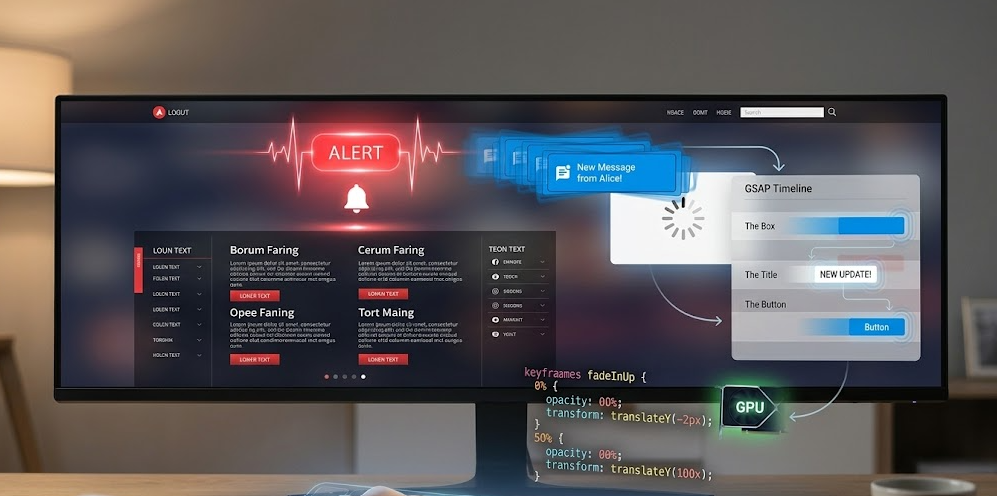
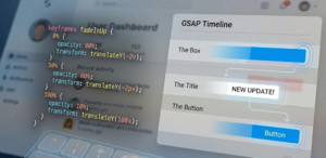
The Pro Choice: GSAP (GreenSock)
If you’ve ever seen a website that looks like a high-end movie, it’s probably using GSAP. This is the industry standard for “choreographed” alerts. If you want five different notification bubbles to pop up in a specific sequence, GSAP makes it easy to time them perfectly without your code turning into a mess.
The Modern React Standard: Framer Motion
Since you are likely working with modern web tools like React or Next.js, Framer Motion is the go-to. It uses “spring physics” (which we talked about in Heading 7) by default. Instead of telling an alert to move at “200px per second,” you tell it to have a “stiffness” of 100. The alert then moves like a real physical object, bouncing naturally into place.
The SVG Powerhouse: LottieFiles
Sometimes a simple circle isn’t enough to alert a user. You might want a complex, hand-drawn animation of a bell ringing or a person waving. Lottie allows designers to export animations from Adobe After Effects into a tiny JSON file. You can then trigger these high-quality “alert illustrations” with just one line of code.
Which Tool Should You Choose?
| Project Goal | Recommended Tool | Benefit |
| Simple Error Shakes | CSS Keyframes | Fastest performance, zero setup. |
| Complex UI Sequences | GSAP | Total control over timing and “flow.” |
| Interactive React Apps | Framer Motion | Makes alerts feel “organic” and tactile. |
| High-End Illustrations | Lottie | Professional-grade art in a tiny file size. |
Conclusion
At the end of the day, the best webpage animations to alert users are the ones that feel invisible. That might sound like a contradiction, but it’s the hallmark of great UX design. When an animation is perfectly timed and purposefully placed, the user doesn’t think, “Wow, that’s a nice slide-in effect.” Instead, they simply feel informed and confident in their next move.
As we’ve explored, creating effective alerts is a balancing act. You have to be loud enough to be noticed (High-Urgency Styles) but quiet enough to be polite (Toasts and Badges). You have to be creative with your motion, but disciplined enough to keep things accessible for everyone.
By implementing the 10 strategies we’ve discussed from respecting “Reduced Motion” settings to optimizing for 60FPS you aren’t just “decorating” a website. You are building a bridge between your code and the human brain. Use these tools wisely, and your users will thank you for a faster, friendlier, and more responsive web experience.
About the Author
Me M.Arsal , I am a freelance web developer and a dedicated student currently pursuing a Bachelor of Science in Artificial Intelligence. With a deep fascination for how human psychology intersects with digital interfaces, I have specializes in building responsive, high-performance web applications that don’t just work they feel intuitive.
When isn’t deep-diving into Data Structures or Operating Systems, i runs MakeUser.com, where he helps brands and services (including major telecommunications providers) grow their digital footprint through smart design and SEO-driven content. My goal is to bridge the gap between complex AI concepts and everyday user experiences, one line of code at a time.